Graphic design in the digital age: making football club crests relevant for future generations. By Graeme Leslie, Designtastic.
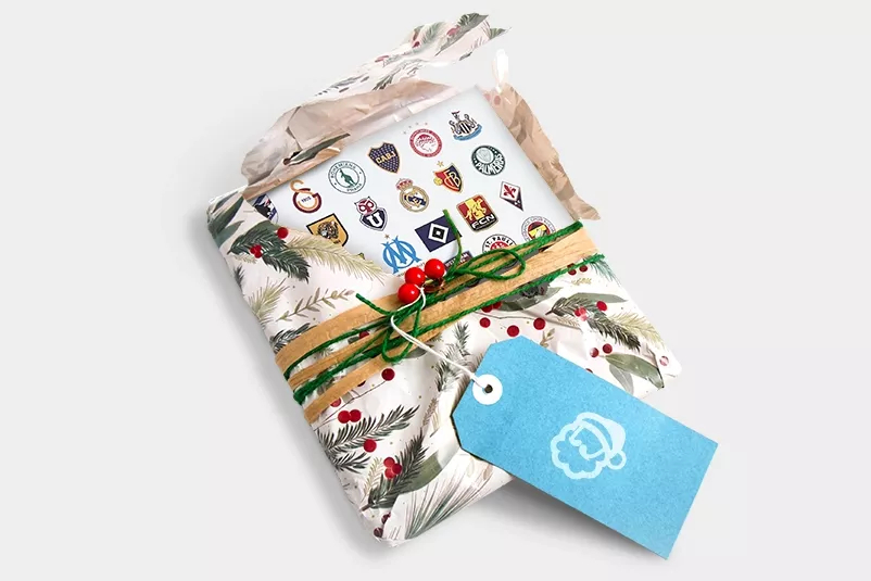

Graphic designers can be a tricky bunch to buy Christmas presents for, especially this particular graphic designer. But this year, Santa excelled himself by bringing me a cracking book: World Football Club Crests: The Design, Meaning and Symbolism of World Football’s Most Famous Club Badges, by Leonard Jägerskiöld Nilsson (or LJN as I’ll refer to him from now on).
Now I’d be the first to admit that this book could be seen as a tough sell - let’s face it, football badges aren’t often in the spotlight for being design classics. Most clubs have been around for over a century and their badge design is often complicated, steeped in history and hasn’t really changed much since their formation. Any attempt at a redesign can often be met with stiff resistance. Just look at the bother Leeds United got into when they attempted to launch their new design in 2017. Facing a 70,000 strong petition from fans against the design, the new crest was removed from www.leedsunited.com within 24 hours, never to be seen again.
What’s become clear to me having read LJN’s book is that attempted redesigns must respect the history and tradition of a club, and that’s no mean feat. A good example of this (although it pains me to say it as an Aberdeen fan) is the new visual identity for Rangers by Scottish design consultancy, See Saw. It succeeds by taking parts of the old crest and refreshing them. “You have to approach the crest with great sensitivity,” says See Saw Creative Director Maurice Hynds. “For football fans, it’s ingrained with their love of the football club. It’s like a calling or symbol.”
And that’s why I love my Christmas present. LJN describes the book as an exploration of “The design, meaning and symbolism of the game’s most famous club crests to reveal why the badges look as they do.” So, without any further ado, here are my five favourite designs from the book, combined with some details about their origins. They’ve all gone through, in my opinion, successful refreshes which respect club tradition and embrace the shift to digital media.
Ajax
When naming their new club in 1900, the founders of Ajax Amsterdam were inspired by Greek warrior Ajax from Homer’s Iliad, who fought countless battles and never lost. This current version of the club badge design, modernised in 1990, bears the colours of the Amsterdam flag (red, white and black) and is very clever. It still sports a portrait of Ajax, as it had since the late 1920s, but is now drawn with just 11 lines to represent the 11 players of the team. And it’s one of LJN’s favourites to boot (pun intended!).

Inter Milan
This is the most recent of my choices and probably my favourite. It was unveiled in 2021 as a ‘streamlined’ version of the original crest from 1908, which featured interlocking letters of the club’s initials FCIM (Football Club Internationale Milano). Interlocking letters are a common theme across graphic design in football, and are hard to pull off without getting into a tangle. The new design of the crest avoids this by removing F C and putting I M front-and-centre. This aligns with global messaging based on the English ‘I am’ to explain the club’s values e.g. ‘I M Brave’, ‘I M Power’ and ‘I M Rebel’. It’s simple, scalable and looks great onscreen, particularly on social media.
Manchester City
Again, this sticks in my throat somewhat, as my English team is Manchester United, but I really like this crest as it conveys plenty of detail in a clever, pared-back style. Redesigned in 2016, it’s based on a fan favourite crest used in the late 1960s and 1970s, and uses elements from the city of Manchester’s crest. These include the Lancashire rose, three diagonal stripes representing Manchester’s three rivers, and a sailing ship referring to the city’s history as an iconic trading port. But what I really like about it is the use of colour, particularly the yellow which is neither too bright nor too cheerful.
Paris Saint-Germain
Launched in 2013 after the club was taken over by new owners from Qatar, this design features elements from the old crest – a stylised Eiffel Tower and a fleur-de-lis, the national flower of France. With the aim of improving “the club’s draw as a global brand”, the word ‘Paris’ has been separated from ‘Saint-Germain’ and made larger. This approach is similar to the one taken by See Saw with Rangers, i.e. taking parts of the old crest and refreshing them for a digital age. The new owners could have chosen to ignore everything that had gone before, but wisely didn’t. They instigated an improvement of a fan favoured design, rejuvenating the brand and keeping the club’s support onside.
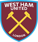
West Ham United
This 2016 design is a return to the crest worn in the 1950s and 60s, when West Ham were represented by two riveting hammers (they were originally founded as Thames Ironworks in 1895). The crossed hammers are also a reflection of the nickname of the club – The Hammers, and the shape of the shield is said to have been inspired by a cross-section of the HMS Warrior, built in 1860 by Thames Ironworks. Again, I like the use of colour here, particularly the subtle shading and engraved T.I.W introduced to the hammers which add weight and sophistication. And the addition of the word ‘London’ is a nice touch, especially for the all-important global fan base.